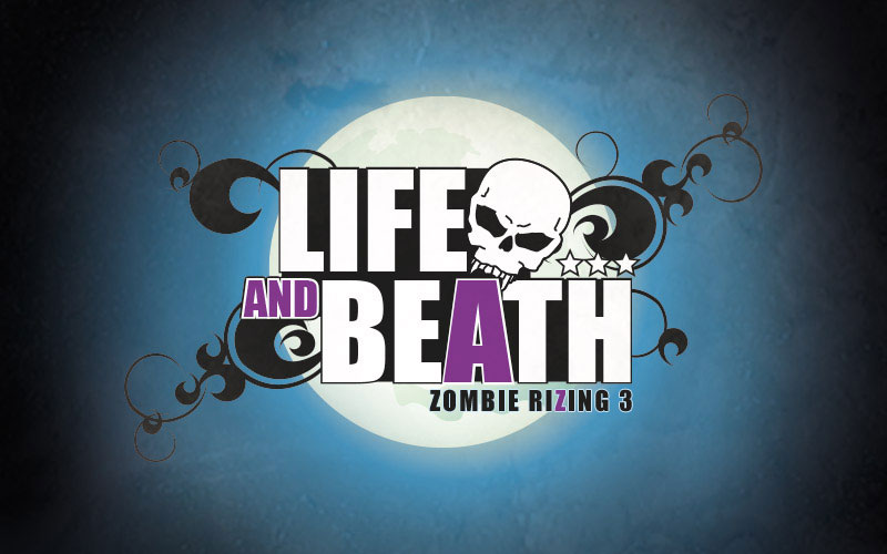
One of favourite parts of each Zombie RiZing book is coming up with the title design. I like to play around with high school type font treatments with elements of tattoo design.
As with the first two season 1 titles I have maintained the purple theme, however book three has lost the ribbon and wings from the first two designs. There were a couple of reasons for the change – I didn’t want to limit the theme of the titles so narrowly so early and I was getting a little concerned the busier titles were competing with Gricey illustrations.
Hopefully you like the result and I can’t wait to see what Gricey does with the cover illustration. Stay tuned for that closer to the April 20 launch of Life and Beath.
But for now, I give you the title…

